
-
Recent Posts
Archives
Course Presentation: Design for the Non-Designer
Posted in Course Design, PDF
Comments Off on Course Presentation: Design for the Non-Designer
Activity: DesignFelt™
The concept with DesignFelts™ is that you can arrange a layout with the multiple cutout elements and then continually work with it. The tactile nature of holding physical objects is an engaging process that is unique from sketching or from working on the computer. The following 8.5×11’s would be cut apart to allow the manipulation of the elements on a page (felt board).
Posted in Course Design, PDF
Comments Off on Activity: DesignFelt™
DESIGN FOR THE NON-DESIGNER Series, Graphic Design: An Introduction
This is the text outline and speaking notes for the visual presentation.
This course is not required for faculty participation. There are a set number of meetings each faculty member must attend each year, one of which this course fulfills. There is an opportunity to capture the interest of the faculty by specifically marketing this course as design that will help you and your students.
Course Goals:
- Make the information relevant to faculty members.
- Keep design concepts basic.
- Have a clear and memorable take away message from each section.
1. WHY GRAPHIC DESIGN
What is Graphic Design?
Graphic design is intentional visual communication.
It is used to solve problems through the visual organization of imagery, shapes and text.
Art+Science=Design
The clinical field is—for the most part—based on science, empirical study and a world of absolutes. Although the field continues to change as new information emerges, it is agreed that it is a science.
In contrast, art has no rules.
Design can be described as a balance between the creative and the scientific structure.
– it uses analysis and critical thinking to approach a problem
– but it solves the “problem” with visual organization
Design is more than decoration.
Design is not just decoration for the sake of beautification
Helps people make sense of information
Design will engage your audience.
Providing visual interest can make a profound impact in communication.
Your are a Profession: Have your work look the part.
Design is important to clinical professionals—especially in the educational arena.
1. Overall professionalism
Taken seriously, respected
2. Transform white papers into appealing publications
- With visual cues
- Graphs
- Supporting imagery
- Scanable easy to read headings and organization
Why design: Looks Matter
Design has permeated our culture.
People expect information worth reading to look like information worth reading.
Why design: Clarity of Message
Graphic design is intent on improving communications across the visual spectrum.
Information design focuses on that transfer of information that will benefit the end user.
Rather than trying to persuade the user to do or think something, the intent is to inform and share specific pertinent data.
Complex information can be confusing even when coming from the best of teachers. Visual aids give the ability to see the full picture, build relational scope and understand intricate systems.
Examples:
- Maps & Cartography
- Charts
- Diagrams
- Forms
- Timelines
- Pictographic symbols
- Calendars
- Directions/Manuals
- Wayfinding
The importance of design critique
Understanding graphic design is important in order to provide effective feedback.
The importance of a clear critique.
1. Hold students and yourself to a design standard worthy of the content being shared.
2. Set expectations/standards and hold yourself/the students to them.
3. Approach design “scientifically.”
– assess the work according to design principles
– if a design is not being effective, challenge the content as well
Knowledge of the principles will give you the confidence to design as well as challenge a design.
2. PRINCIPLES OF DESIGN
Elements of Design:
- Line
- Shape
- Texture
- Space
- Size
- Value
- Framing
- Scale
- Color
- Transparency
- Grid
- Hierarchy
- Pattern
- Diagram
- Motion
- Layers
Design Principles:
The principles of design help to determine how to use the design elements. There are four principles of design: balance, emphasis, rhythm, and unity. These principles of design help you to combine the various design elements into a good layout.
Balance:
Balance is an equal distribution of weight. In terms of graphics, this applies to visual weight. Each element on a layout has visual weight that is determined by its size, darkness or lightness, and thickness of lines. There are two basic approaches to balance. The first is symmetrical balance which is an arrangement of elements so that they are evenly distributed to the left and to the right of center. The second is asymmetrical balance which is an arrangement of unlike objects of equal weight on each side of the page. Color, value, size, shape, and texture can be used as balancing elements.
Symmetrical balance can communicate strength and stability and is appropriate for traditional and conservative publications, presentations, and web sites. Asymmetrical balance can imply contrast, variety, movement, surprise, and informality. It is appropriate for modern and entertaining publications, presentations, and web sites.
To create balance:
- Repeat a specific shape at regular intervals, either horizontally or vertically.
- Center elements on a page.
- Put several small visuals in one area to balance a single large image or block of text.
- Lighten a text-heavy piece with a bright, colorful visual.
- Leave plenty of white space around large blocks of text or dark photographs.
- Offset a large, dark photograph or illustration with several small pieces of text, each surrounded by a lot of white space.
Rhythm:
Rhythm is a pattern created by repeating elements that are varied. Repetition (repeating similar elements in a consistent manner) and variation (a change in the form, size, or position of the elements) are the keys to visual rhythm. Placing elements in a layout at regular intervals creates a smooth, even rhythm and a calm, relaxing mood. Sudden changes in the size and spacing of elements creates a fast, lively rhythm and an exciting mood.
Create Rhythm:
- Alternate dark or text heavy pages with light pages.
- Repeat a series of similarly shaped elements to create a regular rhythm.
- Alternate dark, bold type and light, thin type.
- Alternate dark or text heavy pages with light pages.
- Repeat a series of similarly shaped elements to create a regular rhythm.
- Alternate dark, bold type and light, thin type.
- Repeat the same element in the same position on every page.
Emphasis:
Emphasis is what stands out or gets noticed first. Every layout needs a focal point to draw the readers eye to the important part of the layout. Too many focal points defeat the purpose. Generally, a focal point is created when one element is different from the rest.
Create Emphasis
- Use a series of evenly spaced, square photographs next to an outlined photograph with an unusual shape.
- Put an important piece of text on a curve or an angle while keeping all of the other type in straight columns.
- Use bold, black type for headings and subheads and much lighter text for all other text. Place a large picture next to a small bit of text.
- Reverse (use white type) a headline out of a black or colored box.
- Use colored type or an unusual font for the most important information.
- Put lists you want to highlight in a sidebar in a shaded box.
Unity:
Unity helps all the elements look like they belong together. Readers need visual cues to let them know the piece is one unit-the text, headline, photographs, graphic images, and captions all go together.
Unify elements by grouping elements that are close together so that they look like they belong together. Repeat color, shape, and texture. Use a grid (the underlying structure of a page) to establish a framework for margins, columns, spacing, and proportions.
Create Unity:
- Use only one or two typestyles and vary size or weight for contrast.
- Be consistent with the type font, sizes, and styles for headings, subheads, captions, headers and footers.
- Use the same color palette throughout.
- Repeat a color, shape, or texture in different areas throughout.
- Choose visuals that share a similar color, theme, or shape.
- Line up photographs and text with the same grid lines.
White Space:
White space (the absence of text and graphics) is vital to graphic design. The key is to add just enough white space so the eye knows where to go and can rest a bit when it gets there.
You can control white space in the following location: margins, paragraph spacing, spacing between lines of text, gutters (the space between columns), and surrounding text and graphics.
What to avoid:
- Follow the following instructions for effective layout:
- Use only one or two typestyles and vary size or weight for contrast throughout the publication, presentation, or web site.
- Be consistent with the type font, sizes, and styles for headings, subheads, captions, headers, footers, etc. throughout the publication, presentation, or web site.
- Use the same color palette throughout.
- Repeat a color, shape, or texture in different areas throughout.
- Choose visuals that share a similar color, theme, or shape.
- Line up photographs and text with the same grid lines.
3. DESIGN IN ACTION
- How to approach a design problem
- Analyze the audience.
- Determine the purpose of your message.
- Decide where and how your message will appear.
- Establish goals.
- Organize text and graphics.
- Choose an appropriate format and layout.
- Select appropriate typefaces, type sizes, type styles, and spacing.
- Add and manipulate graphics.
- Organize text and graphics.
- Proofread
- Refine and fine-tune.
Guidelines for Organizing Layouts:
- Use different sizes of type for different elements.
- Establish a hierarchy of type sizes for headlines, subheads, text, etc. and be consistent with formatting. (All headlines should be formatted alike, all subheads should be formatted alike, all text should be formatted alike, etc.
- Make the most important element you want your readers to see the largest and the least important element the smallest.
- Use rules (lines) to separate information into groups.
- Use different weights of type.
- Use white space for design purposes in your publication.
- Position important information in the upper left corner. The upper left corner is usually read first. Place a box around important information.
- Call attention to lists of items by placing bullets in front of them.
- Use colored or reversed type (white type on a dark background) to separate or emphasize.
Active Participation:
Design is not just about looking, but about creating.
1. Separate into groups of two.
2. Use the design element sheets and boards to illustrate the design principles on a:
Awareness and Informational Flyer
Regroup after 15 minutes
Peer Review:
Post the design pieces in the front of the room where everyone can see.
Using the “Critique Criteria” slide as a guide, have each participant identify design elements and principles within the designs.
How were the principles used?
Is the design effective?
What has been done well?
What is one thing that could be done that might improve the design?
What is you favorite part of this design?
Can anything be removed?
Possible Follow-up Classes:
Session II: Digging deeper—The Poster
Session III: Digging deeper—The Presentation
SOURCES:
http://www.online.tusc.k12.al.us/tutorials/grdesign/grdesign.htm
http://www.commarts.com
http://www.understandinghealthcare.com
http://gdbasics.com
Posted in Course Design, PDF
Comments Off on DESIGN FOR THE NON-DESIGNER Series, Graphic Design: An Introduction
Making my first course syllabus
Design For The Non-Designer
Now that I’ve decided my topic, my audience and my intended course length it’s time to dig into the real work of designing the course. Writing a rough outline and jotting down loose ideas was the first step. With everything in my head put down on paper, I can go back to the text and read the chapters with better context of what I might be needing help. Chapter 1 in Tools for Teaching gets right down to business. I plan on commentating on my process and my progress for the course creation as I reference the text and bounce around from chapter to chapter as will be noted.
In the first chapter under the heading “General Strategies” There are several notes about what is most important to consider when starting a course design. A key point that I take away is letting the students needs, and my intentions—as instructor—for the student, guide the course curriculum. It’s easy to think of fun projects and interesting areas to study, but a focused layout with set goals will ensure that it is a success. In addition to having a thought-out plan there are principles that enhance learning as explained in chapter 29. There is a comprehensive list of principles that is validated by research showing how students will better learn, and retain knowledge. There is a subsequent list of practices that if followed will improve the students experience. This chapter goes on to talk about models of intellectual development, structure for students and real-world experiences in courses. Another aspect that could prove helpful to the course I’m working on is titled, “Helping Students Contextualize New Information.” As specialists in their respective areas the concept of “deep learning” engages the students in the significance and meaning of the new material and demonstrates how it can be integrated into what they already know. This will be key to earning the respect and making the principles applicable directly to them as it encourages students to apply the concepts to real-life problems and experiences. Giving the students a framework to fit the new information will make it more memorable. In the course that I’m working on this might mean using handouts that focus on the key concepts using visual aids for clarity. Another category in Chapter 29: Helping Students Learn discusses how to help students retain, retrieve and apply information. Review of the information can be key to retaining. Because my course is a compact session the “review” will have to be done throughout the session rather than from class to class. This will require the instructor to schedule in pauses to review the information just covered.
In chapter 30 learning styles are discussed. It is evident that individuals learn in a variety of styles. My goal for the Design Sessions would be to stimulate each style of learning in a way where everyone is engaged in the process. The syllabus and presentation accommodates for audible, visual and tactile learners. The presentation provides examples illustrating the concepts discussed. For tactile learners there is an opportunity for each participant to put their new understanding into practice. The final section of class pairs up individuals and tasks them to create an engaging layout. In my ideal world the exercise sheets would be printed and cutout from felt—allowing them to be arranged and rearranged even more easily than magnetic paper. Magnetic paper and boards would be an acceptable alternative but would not allow for the same amount of reckless creativity. The DesignFelt™ activity allows participants create a physical connection with the design process—allowing them to explore and arrange type, shape and imagery in unique ways they may never have thought. The exercise helps to reinforce the design principles and techniques that they were just taught.
I met with the individual who would most likely be guiding the course at FHCHS. After reviewing the content he was excited about the prospects of having more buy in from faculty about the importance of design—even in their work. He made recommendations regarding simplifying some of the content. Additionally he recommended some prominent healthcare information designers including Richard Wurman to include in the examples.
Presentation length is always a concern as attention spans begin to drift—especially with so technical information. The design presentation timed out to be 30 minutes or so for the lecture. I would imagine 7-10 minutes for the design exercise and 15-20 for the critique. Participants will leave the class with notes provided them, a better understanding of what graphic design is and how it can improve their communication.
My three goals when setting out on this project have helped me keep focus. They are to: make the information relevant to faculty members, keep the design concepts simple and to have a clear and memorable take away. The true test will come when this course is offered in the next couple of months.
Posted in Course Design
Comments Off on Making my first course syllabus
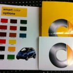
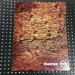
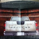
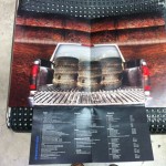
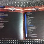
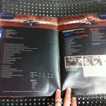
Week 16: Class Final – Brochure Photos
Below is a gallery of the images I captured on the final day of class. You can see the what grade I assigned to each assignment had I been responsible for grading by clicking the image or hovering over it..
-
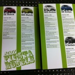
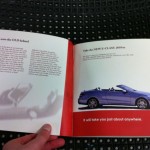
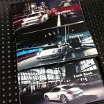
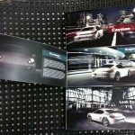
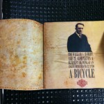
- This student did an excellent job of tying the look and concept from the ads into a full brochure that had a story of its own. The simple barrel fold combined with a diecut pop-up gave the piece a unique interest and a definite wow factor.
-

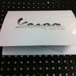
- The brochure is the story of a Vespa owner who loves his Vespa.
-
- Vespa – Foldout
-
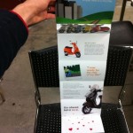
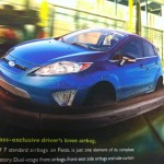
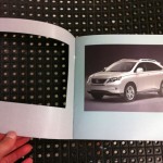
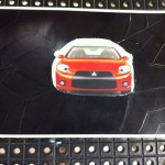
- This student used original photography to create a true sense for what an owner might feel with the car—keeping in their theme of carnival.
-
- The student went a bit further to give the viewer more of an experience by creating a well designed sleeve to hold the booklet.
-
- This was the weakest, least developed section of the booklet. It was a little predictable way of organizing the information.
-
- The student used a range of elements to create a full experience— photography and illustration with type design to complement.
-
- Great image manipulation meshes the concept together smoothly.
-

- Fun game, fun car. The image is well composited—otherwise this could have turned out extremely cheesy. There’s always that fine line.
-
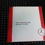
- This student missed the mark on the Mercedes brand. The brochure did not come out looking elegant or expensive. The student lacked creative ideas and had poor execution.
-
- For some reason, the student desperately wanted to include the classic model of the car, but struggled to make it about the new one as opposed to an old car brochure.
-

- This project lacked any flair or luxury the car is known for. Type treatments and layout are mundane with little for the viewer to be excited about—other that the photos.
-
- Die-cuts are a good way to create interest and peak the viewers curiosity. However, in this case there is no reveal whatsoever, in fact the page is left blank. There is no payoff for the viewer and therefore no return for the great expense.
-
- It would seem as though the designer is trying to hide the details about the car by the way it is in the “fine print”—in reverse type at that.
-

- The only explanation here seems to be poor planning. If two blank pages appeared in a portfolio I reviewed I would hand it right back and ask to see the next applicant.
-

- This was a nice idea for a brochure that seems to have gotten lost in the design. Unnecessary items on the cover fight for the attention of equally sized type. The piece does not look polished at first glance. The posters are the highlight of this piece.
-
- The posters are the most inriguing part of the brochure. Perhaps it’s because they are the most polished.
-
- While the poster is executed very well, the brochure overall tells very little to a potential ZNEN buyer.
-
- Poor craft detracts from this design piece.
-
- For a brochure of such brevity an index is not worth the space. It cuts into valuable image space and creates
-
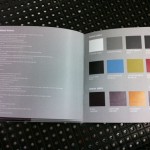
- This page shows the students ability to edit out unnecessary content and make an elegant spread highlighting the cars features. While the use of the logo is clever, the numbers seem unnecessary.
-
- The back pocket of the brochure was intended to store a folded poster. Poor paper choice and measuring make it an eyesore and detract from the brochure. This feature should be revisited if it makes it into the final portfolio.
-
- Overall this brochure had great image selection. The student was wise to let the texture and motion of this image carry the front cover design.
-
- This spread definitely feels like it’s lacking something. Large or small print could challenge the reader or entice them to open the hatch.
-
- Aside from the clearly duplicated stained tires there is nothing that invites the reader to look more closely. The tiny print discourages readers from getting reading more.
-
- This is yet another example of more not being better. I can’t imagine anyone taking the time to read this spread. If they are looking for that depth of detail they would go somewhere where they could actually read the copy.
-
- I have to believe that if the student saw that the type was this small before printing the final he would have changed it. Screen text can be deceptive which shows why it is so important to print drafts of your work if it is destined to be printed.
-

- Simple cover, but is it elegant? The paper selection cheapens the finished piece. In addition it has no tie in whatsoever to the contents.
-
- This unique clasp is almost there. The goal is still to make it look machine crafted and not like a red paperclip.
-
- In retrospect I’m not sure the same people who are intrigued by crossword puzzles are the same crowd as those wheelieing Suzuki’s down the promenade.
-

- The student used clear adhesive to simulate a UV coating. It worked acceptably.
-

- This binding worked well for Jeep as it fit their brand appropriately. I feel that a secondary title could have enhanced the cover and given slightly more information for the reader.
-

- This student used a good balance of imagery, illustration and type design to create their brochure. The elements worked together and kept the brochure moving. I do wish “Home, Orlando” had not been used on the cover. It places too much emphasis on locality and alienates anyone not in orlando. “Home base” or “Start” would’ve been fine.
-
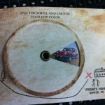
- The wheel was a carry-over from the ad campaign, however it was not used as cleverly in this instance. Rather than picking a color I wish I could pick a model, options, seasons, or perhaps my final destination.
-
- In summary: poor concept and poor craft. This student struggled creating unique concepts and had trouble executing the ideas that were developed.
-
- This student bit off way more than they needed to. Rather than creating one brochure to focus on, she chose to fabricate a box and three unique brochures. While the brochures were well done, the box that held the packing together was poorly crafted and deducted from the overall experience.
-
- The student found a seemingly endless amount of great photos and chose appropriately. Photography focused brochures are truly engaging but require quality images.
-
- Even after being advised to loosen the leading on the paragraph copy no changes were made.
-
- I did enjoy the “round table” critique discussions as it gave everyone an equal vantage point. The one downside was that the work was always upside down for half the class.
-
- The student explains his process, and what he had wanted to do if he had more time. This was an additional piece to a well done, finely produced brochure.
-

- This student understood the power of textures and how they can make a reader want to pick up a design piece. A snap was used to open the booklet as it mimicked a leather satchel.
-
- Interesting historical information about the company was mixed in. Rather than being boring and stale this student used interesting typography to engage the reader.
-
- There is a distinct difference between the historical pages and the new bike info, however they still fit the feel of the book overall.
Posted in Class photos, VCC
Comments Off on Week 16: Class Final – Brochure Photos
Week 16 Summary
The last week of class was filled with excitement. You could tell that at least half of the students were relieved to be finished strong with their projects and were ready for the holiday break. The other half were content to have made it to class with something to show and a couple were happy to not show up to class until quite late—some students just continue to surprise with there lack of interest and drive.
For the most part the students delivered acceptable work. You’ll see in the final photos that craft continues to be a point of contention for most students. Either a lack of drive or a failed prioritization of time appears to be the culprit that students point to when making excuses for poor craft. While they will most likely make it through the class, the work will need to be reworked and reprinted to be successful in a portfolio. Each student may have a good reason for why their project didn’t turn out the way they had anticipated, however making excuses is not acceptable nor is it professional. In instances such as this, where the project has multiple deadlines with plenty of opportunities for review, discussion and improvement there is no room for excuses.
In the past, I’ve come across situations where I felt my project was ready for review. However, it isn’t until I’m sitting down with someone else that, all of a sudden, I notice details that I’ve overlooked, or worse, plan on fixing–but haven’t. It’s a horrible feeling to fumble through excuses in attempt to explain to the critiquer my intentions for the piece. After suffering through this experience too many times I’ve realized how important it is to remove any room I may have to make excuses about my work. Excuses and explanations are different. Explanations are, “I chose this because…” or, “The reason for this is… .” Where as excuses are more defensive in nature. They more than likely start out with, “If I had’ve had more…” or “I meant to…” or “I didn’t know… .” An other difference is in the delivery such as when the statement precedes the presentation as to lower the critiquers expectations rather than done as a complement to the presentation and informative as part of the process. My words of wisdom to future students: don’t leave yourself room for excuses and you won’t have to worry about it. If explanations MUST be made, proceed accordingly, but don’t make excuses for your behavior—just explain it.
Posted in VCC, Weekly Summaries
Comments Off on Week 16 Summary
Additional Class: Portfolio Review Night

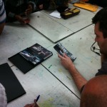
Student Matt Ma shows portfolio to a reviewer.

Student Val Melo shows portfolio to a reviewer.

Student shows portfolio at the VCC Portfolio Review.
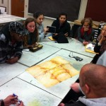
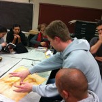
This week I joined the students of the Portfolio Review class. All semester they have been fine tuning their portfolios and learning techniques on how to present themselves professionally. This week it was finally there chance to put all their hard work to the test in a 3 hour long portfolio review session.
Arriving at class there was a distinct air of anxious excitement in the room. The students sat in a waiting area while the reviewers were briefed on what to expect. Most of the reviewers had participated in past semesters and were ready right away to get started. They had a grade sheet for each student they would see. Every 20 minutes the organizer moved students between reviewers. Shuffling the schedules as students or reviewers were late or no-shows, it was a constant challenge to ensure each student received feedback.
The grade sheet (shown below) included items covering professionalism, creativity, design finish and overall presentation. Each reviewer was told to conduct the review much like they would a job interview. Technical design skills and creativity are the prerequisite to get to a job interview, but the interview is what will solidify the position. Employers are looking for personality compatibility just as much design talent. The job interview is the chance for the interviewer to show what more they have to offer. The reviewers understand that this is a practice field for the students and are thus are encouraged to leave feedback that will give them guidance in the real world. Most of all, they were asked to be honest with the students. While the evening was a practice, there were some reviewers looking to fill open positions.
Most of the students seemed to be well-prepared and comfortable discussing their work. Computers were available for students whose work was online. Internet access was not 100% reliable, but well-prepared students had a copy of their work on disc, or on their own laptops. Many of the portfolio’s were hand-crafted. While there were funky boxes, unique cd cases and fun little figurines made of paper many were the typical steel portfolio book. After speaking to several reviewers it was clear that they had been impressed by the Valencia students. I was curious to hear where might there be room for improvement. After some thought he determined that typography was where the most students could improve their work.
Overall the review was just as exciting to observe as I had hoped it might be. Prof. B from the Advanced Graphic Design 1 course had mentioned it on numerous occasions and it all rang true for participating students that night. They had reworked their portfolios for the past 15 weeks in preparation for that night. In addition to fine tuning their final pieces and developing a personal brand they had prepared for the interviews.
Confidently, I can say the review was a huge success. With what data, you may ask, do I back up that statement? After speaking with the organizer I learned that within two weeks 6 students had been hired. In addition to that 14 reviewers were able to give guidance to 19 students on their work, their portfolio’s and their futures. As the final class in the Valencia program it does justice to the students who’ve put in the effort and shows confidently the level of design instruction VCC has delivered.
Posted in Class photos, PDF, VCC, Weekly Summaries
Comments Off on Additional Class: Portfolio Review Night
Week 15 Summary
Today was the last class before final projects are due. In Advanced Graphic Design I there are no final exams per se, although the last project is worth the majority of the class grade. Students were to bring their final assignments as close to finished as possible. Most brought color mock-ups folded but not fully assembled. At this point students have nailed down their concepts, refined their artwork but continue to tweak the copy and heading type. In a general statement to the whole class, Prof. B. expressed his disappointment regarding the craft of each students work thus far shown. He went so far as to say, “You might as well just write the F on it for me.” As tough as it sounds now, the context was more light-hearted. He was trying to catch their attention and bring focus to their floundering efforts of craftsmanship. He did couple his comments with encouragement of their design overall, but reminded them that if it looks and feels like junk that the client would be blind the design regardless.
Design craft is a talent that must be fine tuned for designers attempting to impress potential employers. Craft of a finished piece can be the finesse that brings it to the next level, or the flaws that distract to its detriment. If a student doesn’t have the capabilities to create a quality piece either due to patience, attention to detail or experience then it is their duty to find someone who does. Learning folding techniques using the proper design tools such as a bone (http://www.michaels.com/Martha-Stewart-Crafts™-Bone-Folder/pc0735,default,pd.html?cgid=products-scrapbooking-marthastewartcrafts&start=1) or a burnishing tool (http://www.artcorridor.com/metal-tooling.html?psps_page=3) can greatly improve the finished product. Having the right tools such as a rotary cutter and a cutting surface that can handle the project will also yield better results. With so much work put into the design, it would be a shame to short change the final piece.
Posted in VCC, Weekly Summaries
Comments Off on Week 15 Summary
Week 14 Additional Class
A requirement of the teaching internship is to sit in on two other courses sometime in the semester. With a limited schedule (only available after 5pm) I was somewhat limited to which classes I could join. I was hoping on sitting in on a lecture course but had to settle for yet another produce–create–and–critique classes. Of course with a different teacher the class operates quite differently. I arrived to class on time only to find the entire class waiting outside the door. I asked a student to be sure I was in the right place and they responded confirming I was—and also that the teacher was always late. I thought that was an interesting behavior for a teacher to model—but then again night class teachers are often full-time professionals who teach as a way to give back to the community. The setup of this class was considerably different. The course was publication design and was taught in a computer lab. It had a technical aspect to the class that Advanced Graphic Design I did not, in that the teacher was expected to educate the students on document setup and other publication related file creation. The day I sat in on the class there were 12 students. The teacher sat at the front of the u-shaped computer station setup and was plugged into a projector with his computer. At the beginning of class he asked if anyone had any questions about their last assignment—and someone did. They were wondering if he could “refresh” their memory on how to setup a file with diecuts. Being a helpful professor, he did just that. Being an unplanned professor he didn’t have any docs setup nor any working files. Rather than explain the steps to the students and then moving on, he spent about 15 minutes muddling around in InDesign, using keyboard shortcuts that were not always explained and talking about how the machines setup was totally confusing and slowing him down. Thirty minutes into class critique started. Everyone gathered on one side of the room and each student went one-by-one up to the pin board and posted their progress. The project was a car brochure—ironically enough the same project as in my AGD1 class. I found it additionally amusing that there were two students focusing on Vespa’s in this class—clearly the number one “cool” mode of transportation for students. The critique in this class was considerably different. For whatever reason very few students had anything to say about anyones work. The prof. would lead out each students critique by asking what the others thought. After a couple seconds of silence he would remind the students how important it is to give feedback—and then he would analyze the work for 15-20 minutes. In some ways his critiques were helpful to the students by showing how a critique could go. However it seemed as though the only person benefiting was the student who’s work was under scrutiny. This process didn’t appear to be teaching how to critique but how to be critiqued. The professor seemed more like an art director—asking to see more of this or less of that. When elements came down to a matter of taste, and not a concrete design rule he recommended considering the piece from a prospective client or employer. Asking questions an employer might ask challenges the work—not the creator. Experiencing first hand how miserable critiques can truly be, as instructor as well as watching from the sidelines in two different classes, I’m convinced there must be a better method. Are there tools out there? Are there defined theories to train designers how to conduct effect critiques? Without a doubt there there are effective professors out there. Sharing ideas will improve both the student experience and the quality of work produced.
Posted in VCC, Weekly Summaries
Comments Off on Week 14 Additional Class
Week 14 Summary
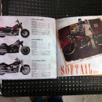
Although I’ve been in sitting in on class for the past 14 weeks, I continue to be baffled by student attendance. It seems as though each week one third to half of the students choose not to show up. As I think about it, I wonder their reasoning—considering there is a fairly strict policy about missing classes. As I puzzle what the case might be I can only think of a couple scenarios, a) the student has an emergency—which is unlikely the case in every situation as there are so many absentees, or, b) the student doesn’t feel that class attendance is necessary for their success. In other words the student doesn’t feel like they will be missing anything if they skip. In a critique-focused class where lectures are not an every class occurrence it seems like the students don’t take as many notes. With no test to prepare for, they work on their projects and submit their ideas for review. I imagine students would be more attentive in class and more likely to show up if there was something they would be missing—beyond their peers opinions and teachers feedback on their projects.
This aside, class critique was much more productive today. The students have developed their ideas more thoroughly and many are looking in pretty good shape for the final in two weeks. Several students are showing promise as they tie their projects into the ad series more effectively. The student designing for Vespa is using similar illustration style to their ads with a simple barrel role to share a moped love story. Another student has ideas—still not down on paper—to marry the new Harley to imagery and a feel of yesteryear bikes. This could potentially be an excellent piece. There is an ambitious student planning making a three booklet series for Porsche that goes in a box set. And then there are a couple of uninspired layouts that are just straight boring. I find it the most challenging to give feedback regarding these projects as there isn’t enough to really build on. It’s hard to tell students to go back to the drawing board when most likely they will continue to struggle. Their lack luster efforts yield dismal creations and takes an fun of critique out of the picture. Teaching students to harness their creativity is one thing, but teaching students to be creative is a daunting task. With that in mind there are brainstorming techniques that could be done in class to help students along the way. I imagine every student would benefit from timed, interactive, creative exercises in class. I don’t think it would hurt the class to bring in a little more structure here and there.
Posted in VCC, Weekly Summaries
Comments Off on Week 14 Summary