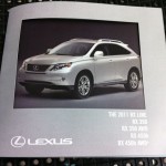
Below is a gallery of the images I captured on the final day of class. You can see the what grade I assigned to each assignment had I been responsible for grading by clicking the image or hovering over it..
-
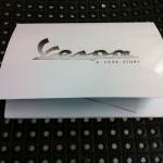
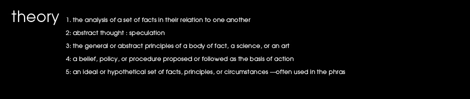
- This student did an excellent job of tying the look and concept from the ads into a full brochure that had a story of its own. The simple barrel fold combined with a diecut pop-up gave the piece a unique interest and a definite wow factor.
-
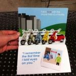
- The brochure is the story of a Vespa owner who loves his Vespa.
-
- Vespa – Foldout
-
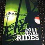
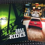
- This student used original photography to create a true sense for what an owner might feel with the car—keeping in their theme of carnival.
-
- The student went a bit further to give the viewer more of an experience by creating a well designed sleeve to hold the booklet.
-
- This was the weakest, least developed section of the booklet. It was a little predictable way of organizing the information.
-
- The student used a range of elements to create a full experience— photography and illustration with type design to complement.
-
- Great image manipulation meshes the concept together smoothly.
-
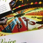
- Fun game, fun car. The image is well composited—otherwise this could have turned out extremely cheesy. There’s always that fine line.
-
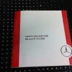
- This student missed the mark on the Mercedes brand. The brochure did not come out looking elegant or expensive. The student lacked creative ideas and had poor execution.
-
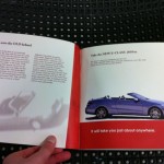
- For some reason, the student desperately wanted to include the classic model of the car, but struggled to make it about the new one as opposed to an old car brochure.
-
- This project lacked any flair or luxury the car is known for. Type treatments and layout are mundane with little for the viewer to be excited about—other that the photos.
-
- Die-cuts are a good way to create interest and peak the viewers curiosity. However, in this case there is no reveal whatsoever, in fact the page is left blank. There is no payoff for the viewer and therefore no return for the great expense.
-
- It would seem as though the designer is trying to hide the details about the car by the way it is in the “fine print”—in reverse type at that.
-
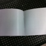
- The only explanation here seems to be poor planning. If two blank pages appeared in a portfolio I reviewed I would hand it right back and ask to see the next applicant.
-
- This was a nice idea for a brochure that seems to have gotten lost in the design. Unnecessary items on the cover fight for the attention of equally sized type. The piece does not look polished at first glance. The posters are the highlight of this piece.
-
- The posters are the most inriguing part of the brochure. Perhaps it’s because they are the most polished.
-
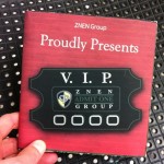
- While the poster is executed very well, the brochure overall tells very little to a potential ZNEN buyer.
-
- Poor craft detracts from this design piece.
-
- For a brochure of such brevity an index is not worth the space. It cuts into valuable image space and creates
-
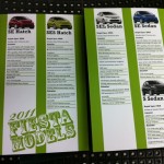
- This page shows the students ability to edit out unnecessary content and make an elegant spread highlighting the cars features. While the use of the logo is clever, the numbers seem unnecessary.
-
- The back pocket of the brochure was intended to store a folded poster. Poor paper choice and measuring make it an eyesore and detract from the brochure. This feature should be revisited if it makes it into the final portfolio.
-
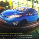
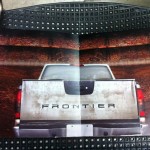
- Overall this brochure had great image selection. The student was wise to let the texture and motion of this image carry the front cover design.
-
- This spread definitely feels like it’s lacking something. Large or small print could challenge the reader or entice them to open the hatch.
-
- Aside from the clearly duplicated stained tires there is nothing that invites the reader to look more closely. The tiny print discourages readers from getting reading more.
-
- This is yet another example of more not being better. I can’t imagine anyone taking the time to read this spread. If they are looking for that depth of detail they would go somewhere where they could actually read the copy.
-
- I have to believe that if the student saw that the type was this small before printing the final he would have changed it. Screen text can be deceptive which shows why it is so important to print drafts of your work if it is destined to be printed.
-
- Simple cover, but is it elegant? The paper selection cheapens the finished piece. In addition it has no tie in whatsoever to the contents.
-
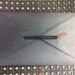
- This unique clasp is almost there. The goal is still to make it look machine crafted and not like a red paperclip.
-
- In retrospect I’m not sure the same people who are intrigued by crossword puzzles are the same crowd as those wheelieing Suzuki’s down the promenade.
-

- The student used clear adhesive to simulate a UV coating. It worked acceptably.
-
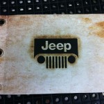
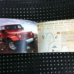
- This binding worked well for Jeep as it fit their brand appropriately. I feel that a secondary title could have enhanced the cover and given slightly more information for the reader.
-
- This student used a good balance of imagery, illustration and type design to create their brochure. The elements worked together and kept the brochure moving. I do wish “Home, Orlando” had not been used on the cover. It places too much emphasis on locality and alienates anyone not in orlando. “Home base” or “Start” would’ve been fine.
-
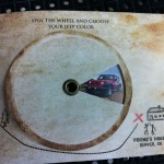
- The wheel was a carry-over from the ad campaign, however it was not used as cleverly in this instance. Rather than picking a color I wish I could pick a model, options, seasons, or perhaps my final destination.
-
- In summary: poor concept and poor craft. This student struggled creating unique concepts and had trouble executing the ideas that were developed.
-
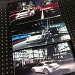
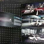
- This student bit off way more than they needed to. Rather than creating one brochure to focus on, she chose to fabricate a box and three unique brochures. While the brochures were well done, the box that held the packing together was poorly crafted and deducted from the overall experience.
-
- The student found a seemingly endless amount of great photos and chose appropriately. Photography focused brochures are truly engaging but require quality images.
-
- Even after being advised to loosen the leading on the paragraph copy no changes were made.
-
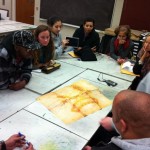
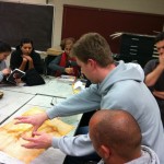
- I did enjoy the “round table” critique discussions as it gave everyone an equal vantage point. The one downside was that the work was always upside down for half the class.
-
- The student explains his process, and what he had wanted to do if he had more time. This was an additional piece to a well done, finely produced brochure.
-
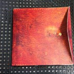
- This student understood the power of textures and how they can make a reader want to pick up a design piece. A snap was used to open the booklet as it mimicked a leather satchel.
-
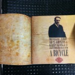
- Interesting historical information about the company was mixed in. Rather than being boring and stale this student used interesting typography to engage the reader.
-
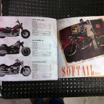
- There is a distinct difference between the historical pages and the new bike info, however they still fit the feel of the book overall.