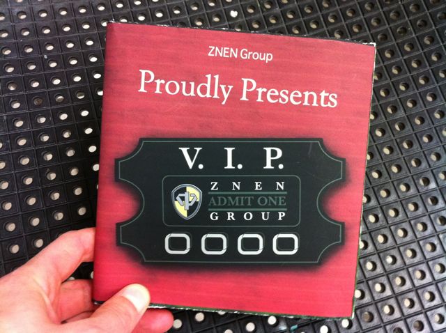
This was a nice idea for a brochure that seems to have gotten lost in the design. Unnecessary items on the cover fight for the attention of equally sized type. The piece does not look polished at first glance. The posters are the highlight of this piece.