-
- This is the poster that I felt could have used a consistent border to help set emphasize the ragged torn look.
-
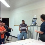
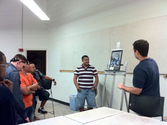
- PSA: Dog fighting poster
-
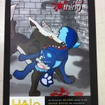
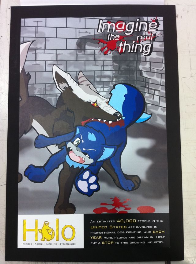
- This is the poster that was completely revamped after receiving clear direction from the class and professor. I wish it had used more vibrant colors to reflect the illustration style it was mimicking.
-
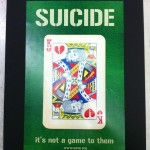
- Consistent improvements were made. The weathered card was a good direction to take it.
-
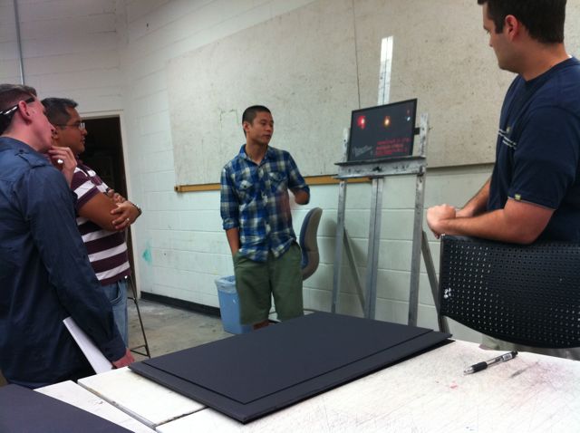
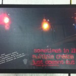
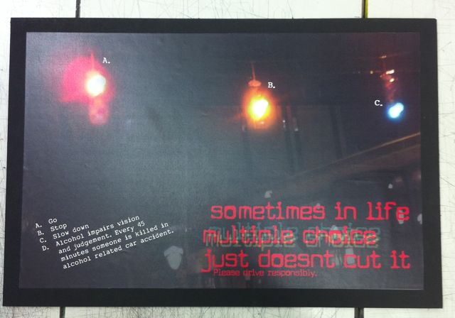
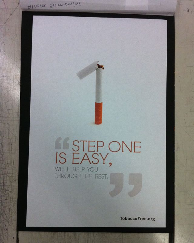
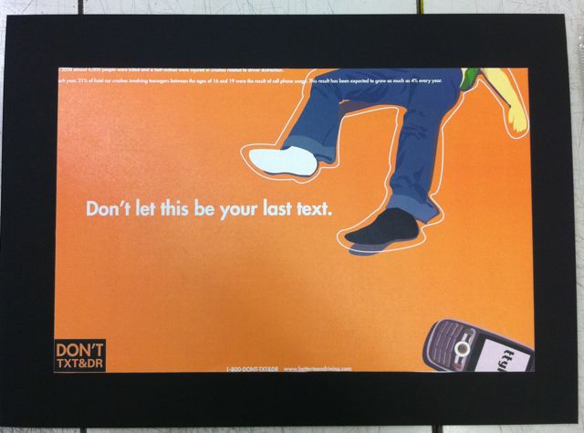
- This finished poster made significant progress from the previous week. The tagline type is a little challenging to read but overall the poster grabs the viewers attention.
-
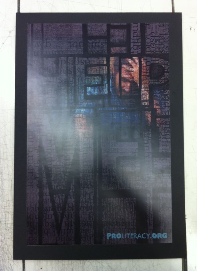
- Pro Literacy poster
-
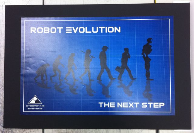
- Subtle changes were made to the final. Definitely in the top 3 posters of the class.
-
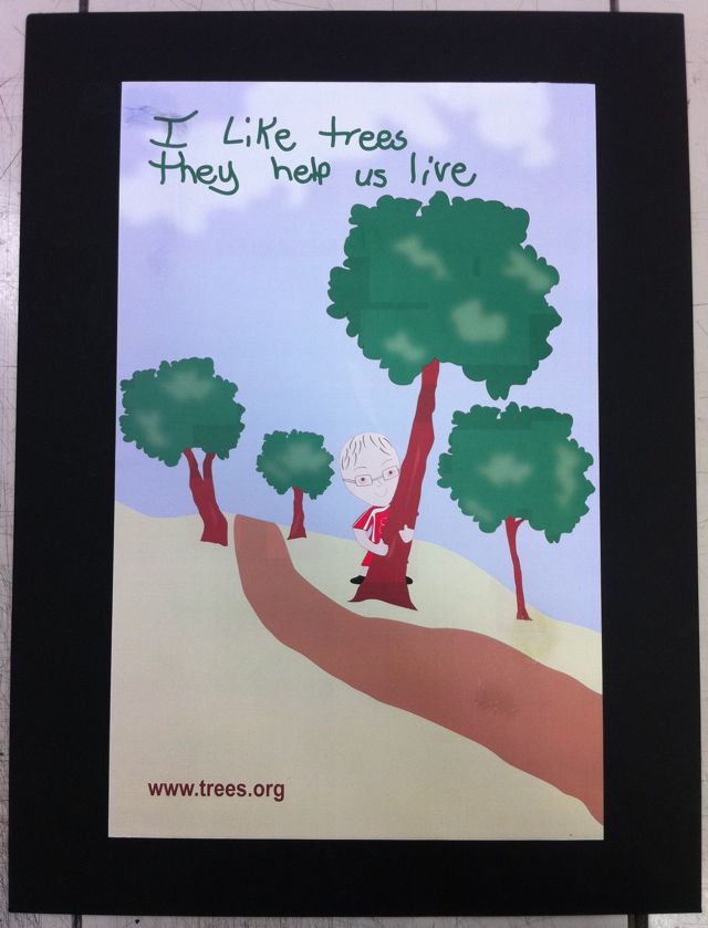
- While the student listened to the feedback—the poster came back to class looking even less inspired than the first draft.
-
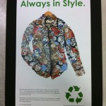
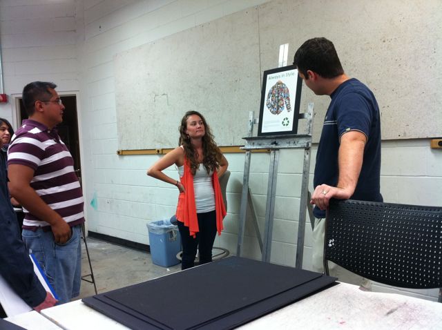
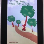
- Recycling awareness poster.
-
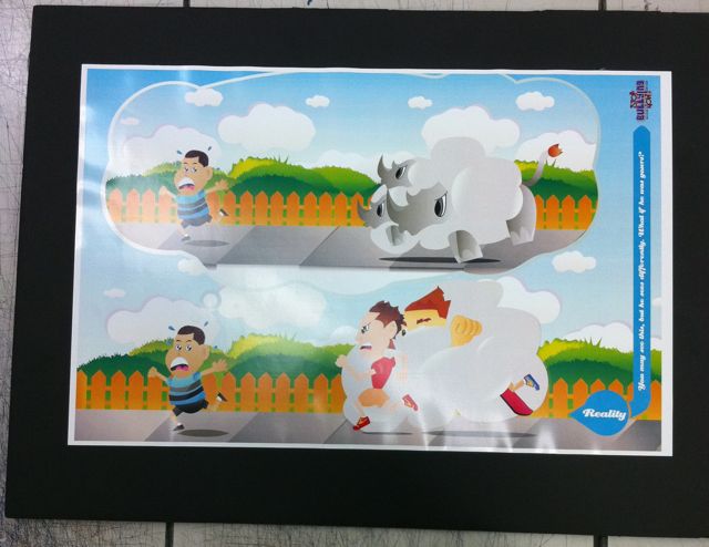
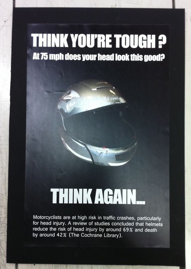
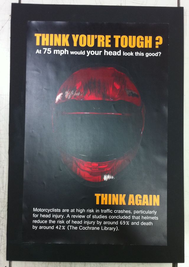
- Different helmets—slightly different taglines, but still nothing demanding attention. Some work yet to be done.
-
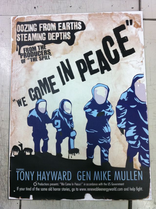
- Another students work who did not listen to the class or prof. Changing the concept at the last second caused the teacher to bring up how harmul this can be in the industry.