
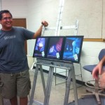
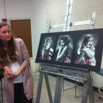
This week was a final critique class. It’s still surprising to me the difference of engagement between students towards the course. I understand that students share different passions but AGD1 is really a pivotal course in the degree program that can seemingly predict future portfolio success. With that said, mostly everyones projects were remarkably more refined and put together this session. They seem to be responding well to the discussion in class and putting in the effort.
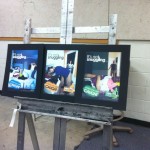
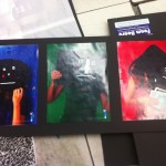
This week the students series of ads were due. The assignment was to create three finished ads that feature a beauty product. The students selected a range of items from lipstick and moisturizer to beard trimmers and sanitary wipes. The results varied. The strength of the concept has become driving factor to the success of the work as the technical execution takes the back seat. In this course, and moving forward the students will find that it is the best ideas coupled with technical follow-thru that earn them the top awards.
-
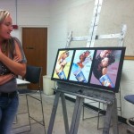
- Sanitary wipes: solid concept, superb execution. This student was attentive to the professors/students critique and made a great cohesive campaign showing dirty hand prints under a black light. Prof. B made the wise suggestion that this piece should be in his portfolio, but be able to be skipped once feeling out the situation in an interview.
-
- Snuggie softener: original photography, consistent look, clever concept. The photography was created to frame the secondary subject effectively. Although the “static” or “soft” text background meant different things to different people it still worked with the product.
-
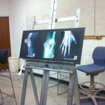
- Osteo medication: good clear direction with room for improvement. The student focused on the visual to carry the ad while the supporting elements can be just as important. The tagline appears randomly treated and could have played more cohesively with the X-ray theme.
-
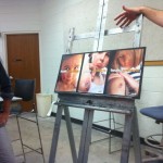
- Neosporine: very strong concept, disappointing execution. This student had a good concept but over treated it using photoshop filters and little restraint. Little germ-like creatures were created to overlap the cuts and scrapes, but since the last review they became overly gruesome. Also, a new image had considerable issues as the text and image eyes caused considerable tension—not good tension.
-
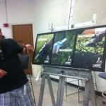
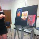
- Manscaping: The one word tagline that connects the product with the target audience is highly effective. A couple comments were to line up titles and to remove the tattoo. Both these comments I disagreed with on the premise that the ads are unmistakingly part of the same series, and two: a tattoo is very manly. If anything—they should all have tattoos—and possibly a Norelco logo tattoo. My one critique was to correct the gray balance on one of the images to keep them consistent.
-
- Tide: This student spent too much time trying to work in the scratch and sniff aspect and too little time on the effectiveness of the concept. It didn’t come together in the end as it lacked focus, an overarching theme and a weak call to action.
-
- Nivea: While this wasn’t necessarily one of the stronger pieces in the class, the student improved leaps and bounds each week. The progress is encouraging—especially as it is clear that the critique sinks in. There is still plenty of changes that could be made yet to this series.
-
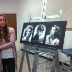
- Bourgeois: The vintage look with the highlight lipstick color can be done wrong and it can be done right. This student did an excellent job using restraint and good taste to treat the images. Her concept was so solid she actually did 3 additional ads in the same series.
-
- Secret: This is another student who has shown personal growth in the class. The concept is solid, the ad is emotive and the graphics are well executed. A couple comments brought up were the poor legibility of white text on yellow paper, and the vector shape scaled up in lieu of a realistic looking brush stroke.
As mentioned in previous posts, Prof. B approaches the class much like a design firm, with him being the lead creative director. The students pitch the concepts, write the copy and execute the finished pieces but not without a lot of feedback from their peers and from him. With this in mind students would do themselves a favor if they listened to the recommendations from their creative director! It confuses me to imagine what a student might be thinking when he/she hears specific instructions from the teacher and completely disregards them. Of course there is room for creative inspiration but in this situation, the teacher is the boss. While the grade is not as important as the finished portfolio, the designer-client/boss relationship is even more important. The classroom is the ideal setting to cultivate these crucial skills as it hasn’t cost any work—yet.